Designing a tool to help new gamers find what gaming computer set-up is best suited for them.

The Context and Role
Buying a new computer is an overwhelming process; this is particularly true for gaming computers where understanding device specifications is critical. However, this requires parsing through a plethora of jargon which many new gamers have little background in.
Over the course of my internship, in addition to conducting and presenting weekly curations of competitive analysis and industry research, I was also tasked with developing my own long-term project. After much brainstorming, my design team and I determined that designing for new gamers was a promising opportunity space.
The Team
Me (Primary Product Designer, Intern)
Yu Yuan (UX Researcher)
The Problem
New gamers are overwhelmed and uninformed about the process of picking out new gaming computers.
The Solution
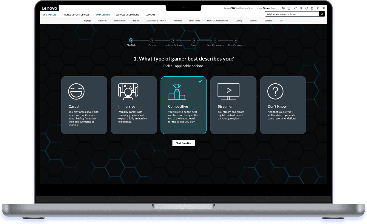
I created a six-question wizard that offers personalized recommendations and rationale behind those decisions.
The Journey
This story can be broken down into four chapters. Click the sections to jump ahead.
Defining what it means to be a "new gamer" and uncovering their pain points.
Crafting the content of the experience to be useful yet informative.
Moving from wireframe to high-fidelity, explained with specific examples from my designs.
Making my project come to life for my final intern presentation.

Chapter 1: Empathizing
I first worked with my team's UX researcher to understand the previous research that had already been done on Lenovo's gamer demographic. After analyzing and discussing Lenovo's pre-existing research, my team and I identified new gamers as a segment with particularly salient needs.
This category can be split into two specific types: the completely new gamer and the slightly more experienced gamer. Below are the two personas that I defined and subsequently utilized for the rest of my design process.

The Completely New Gamer
Doesn't understand computer specifications
Overwhelmed by all the options available
Unsure if their PC is compatible with the games they hope to play

The Slightly More Experienced Gamer
Has a basic understanding of specifications (bigger is better)
Wants to learn more about what's “under the hood”
More competitive
Wants to know that they’re getting the latest hardware
Chapter 2: Content Design
After defining the problem, I conducted secondary research to 1) explore what digital experiences already exist to help deliver recommendations and 2) to learn more computer and gamer terminology. I was able to determine that a survey-based experience (aka the wizard) would be most user-friendly way to funnel a user through new concepts in a step-by-step manner.
A survey's crux is it's content, so I utilized a content-first design process. I chose six questions to feature on the wizard because based on previous Lenovo user research, ten questions is the maximum that most users were willing to tolerate for any survey-like process. I pared down my initial list of questions to what I deemed most important based on my research.
What I Asked
What type of gamer best describes you?
What purposes do you plan to use your PC for, other than gaming?
What genre of PC games do you plan to play or currently play?
Do you prefer a laptop or desktop?
What is your budget?
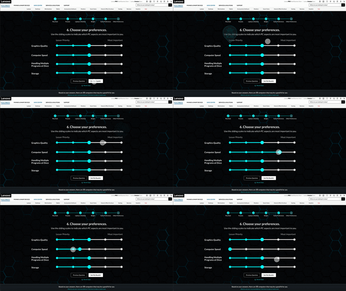
What are your preferences? (Prioritize these four qualities: graphics quality, computer speed, ability to handle multiple programs at once, and storage capacity)
Why I Asked
Q1 and Q2: I want to know the user's intended use-cases to see if they need of a more powerful computer vs. an entry level one.
Q3: This references a new gamer’s concern that their computer may not support the games they want to play, so I want the user to be assured that the final recommendation will account for this.
Q4 and Q5: Big filtering questions that will significantly narrow options for users so we’re able to provide a much smaller list of recommendations as to not be overwhelming.
Q6: To avoid confusing those with limited technical knowledge, the four qualities listed are the non-jargon names for important computer specifications. The goal of this question is to fine-tune the results and account for the fact that we might not be able to find THE perfect match, and will allow us to provide the closest match.
Chapter 3: Iteration
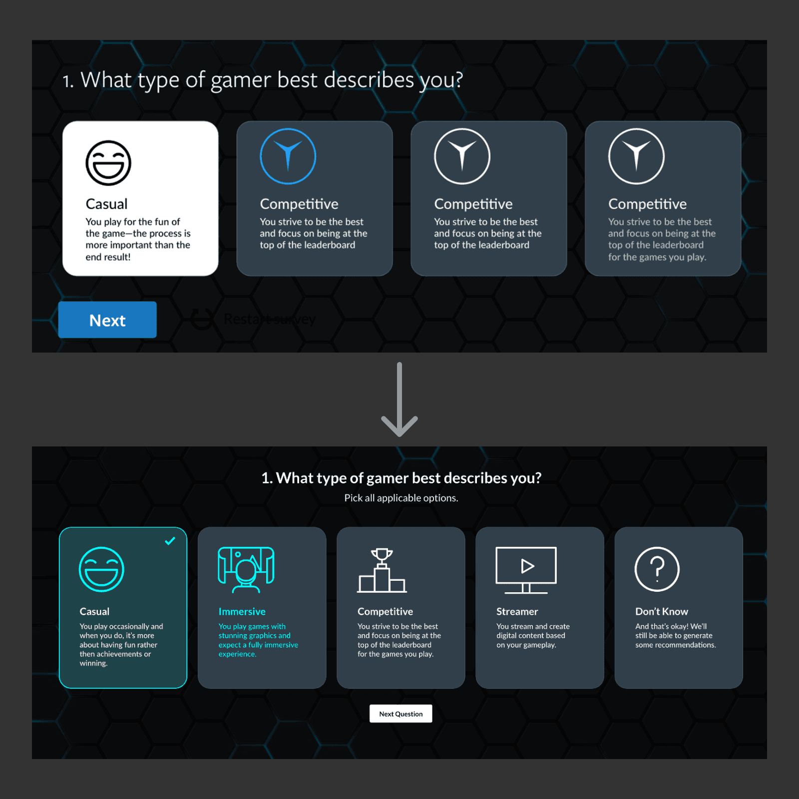
After determining these questions, I began iterating the look and feel of the wizard over the second half of my internship. I collaborated with my team regularly to gather feedback and learn more about the Lenovo gaming design system. Below, I detail the key decisions and my rationale for this project.
Using Cards
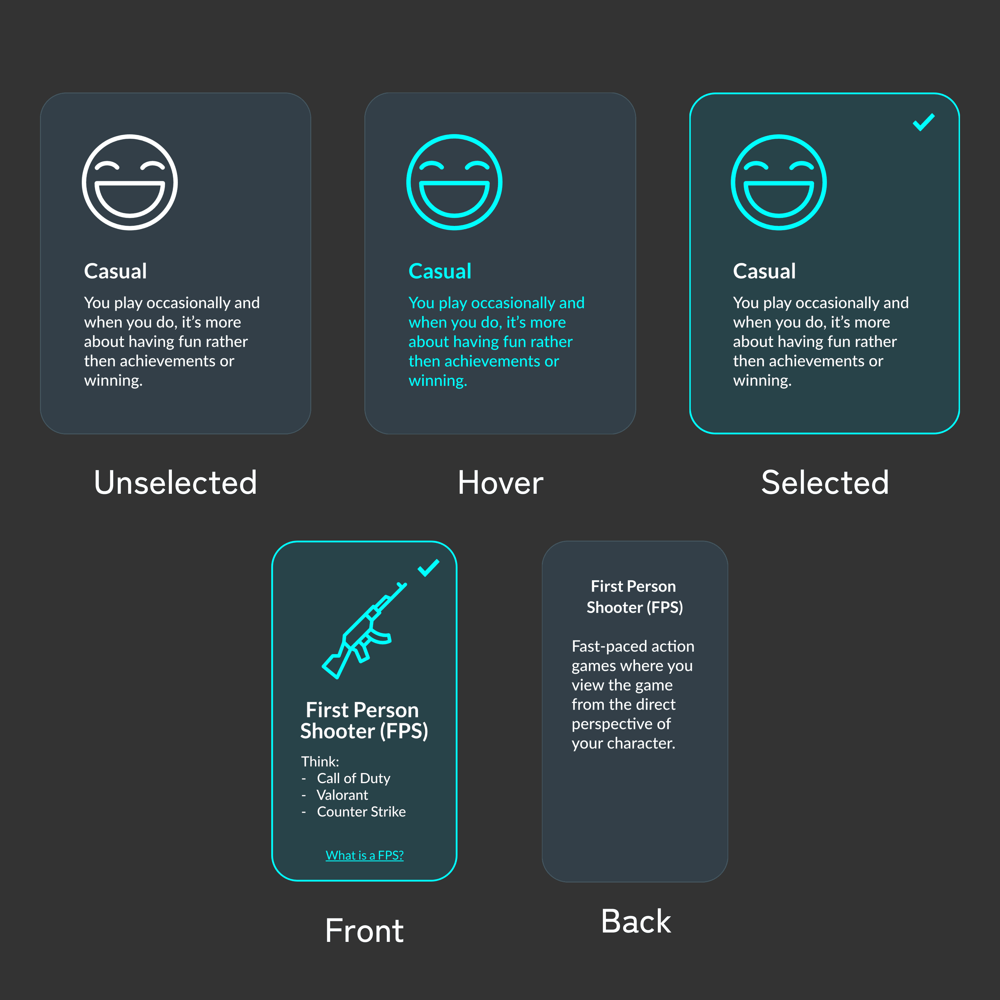
One constant throughout my iterations was utilizing cards structured with an icon, headline, and an explanation of that headline. I wanted to make it easier for more experienced gamer to quickly scan each card, while still remaining informative to new gamers who may not know what these terms and concepts are yet.
I designed several version of the cards to account for different states and needs. For example, I included a checkmark for the selected state as my team commented that I shouldn't have color as my only indicator of selection to be accessible. Meanwhile, for the cards about game genre, I made the card flippable to provide a definition of what that genre is.
Not Using Cards
For questions about priorities and preferences. I used sliders because it’s difficult to talk about preferences in an absolute way. Additionally, for further clarity, I included little bubbles that appear on hover to explain how a user’s choice would affect the final recommendation. For example, choosing most important for graphics quality would mean that we would prioritize recommending computers with the best graphical performance.
Progress Indicators
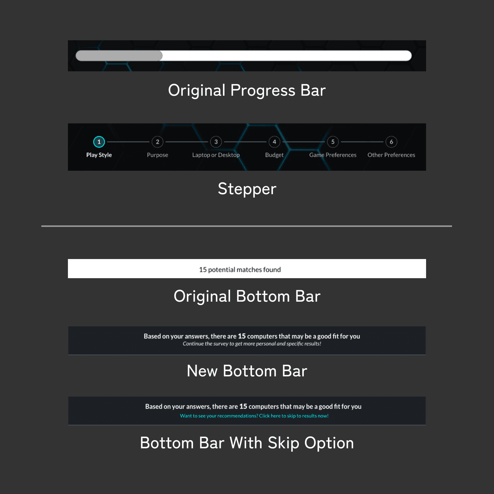
Between the low-fidelity and high-fidelity version, I switched from a progress bar to a stepper that makes next steps clear. Based on industry standards, it is best practice to keep users informed about what is ahead to remain engaged. Additionally, the user is able to click on steps to navigate, letting the stepper also serve as a navigational tool.
I also wanted to provide users another sense of progress, in that I want them to feel like each of their answers are directly contributing to the end result, and therefore feel compelled to complete the survey. I designed an indicator at the bottom of the page to show how many recommendations they have based on their choices thus far or even the option to skip to the end if the user feels satisfied.
Loading Screen
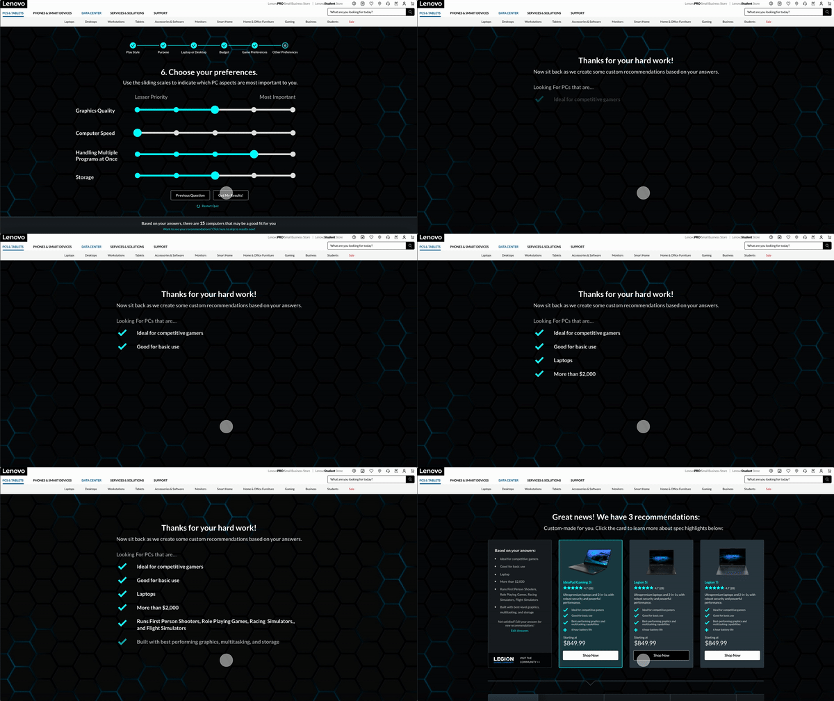
This load screen appears after submitting one’s survey answers and was inspired by what I had found during competitive analysis. Once the user clicks submit, the user’s answers are re-listed to make the user feel heard and reinforce this idea of personalization. The delayed response provides the impression that there is an algorithm “working,” which increases the credibility of the incoming recommendations in the eyes of the user.
Results Screen
The results page provides multiple top recommendations so the user has a reasonable selection to choose from. On the left, the user’s answers are reiterated so they are reminded of what is important to them. Next, each top option offers a list of reasons that explain how these recommendations match or even exceed their preferences. Additionally, toggling between these cards changes the specification highlights in the horizontal scroll at the bottom of the page. This section explains more deeply how each specification aligns with what the user wants and how it compares with industry standards. This helps gamers quickly understand why this computer would be a good match for them while also being educational.
Chapter 4: Delivery
For my final internship presentation, I had the chance to demo my final project for my team and several external stakeholder. I put significant care into prototyping clean interactions and animations, especially because a large part of my internship involved conducting audits on the Lenovo site and then researching industry best practices when it came to micro-interactions and animation. My presentation and designs were well-received by my audience, and a director reached out to me to discuss potentially leveraging my work on the website.

Takeaways
Since this was my first corporate design experience, I learned so much about what it means to be professional designer and finding my place within systems bigger than myself. Here are three specific things I was able to improve on:
Design Systems
I had never worked with a design system before so it was interesting to work within these additional design constraints—I felt like I was playing with Legos.
Adobe XD
I had only used Figma prior to this experience so developing fluency in different design software was empowering and reinforces my ability to adapt quickly.
Professionalism
I gained significant confidence by interacting with more experienced designers as I learned how to not only support my teammates more effectively, but also ask for help and feedback.

